Brand Strategy & Identity
From a splash to a brand.
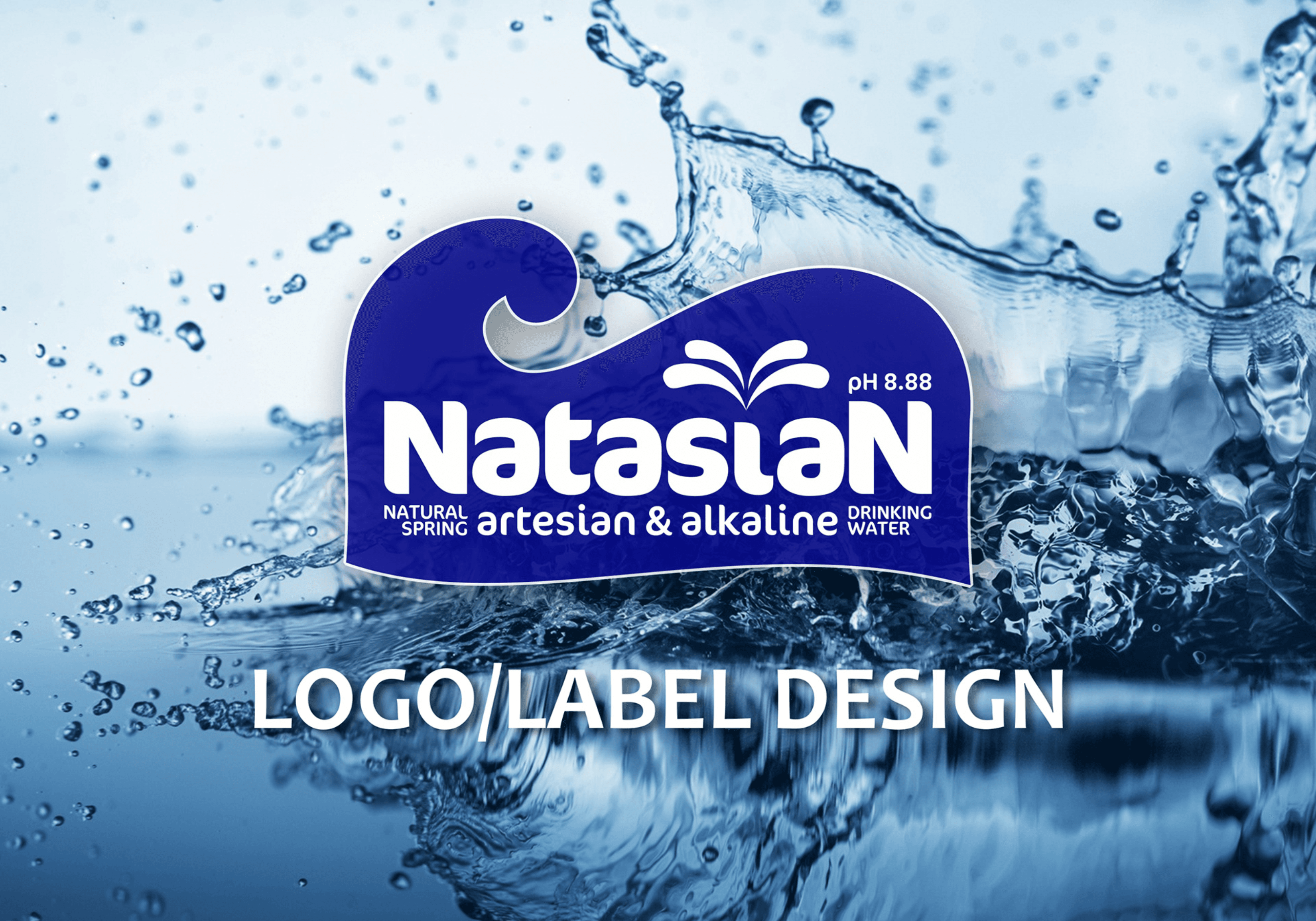
A visual identity development project that transformed the qualities of natural spring alkaline water into a cohesive and recognisable brand expression for Natasian.
- Client
- Natasian Water
- Year
- 2014
- Location
- Lagos, Nigeria
- Services
- Brand Strategy, Logo Design, Visual Identity, Packaging Design, Art Direction
The challenge
The brand needed more than a name and logo. Its identity had to communicate natural spring water, purity and an alkaline proposition while remaining simple enough to work effectively across a physical bottle and label.
Our approach
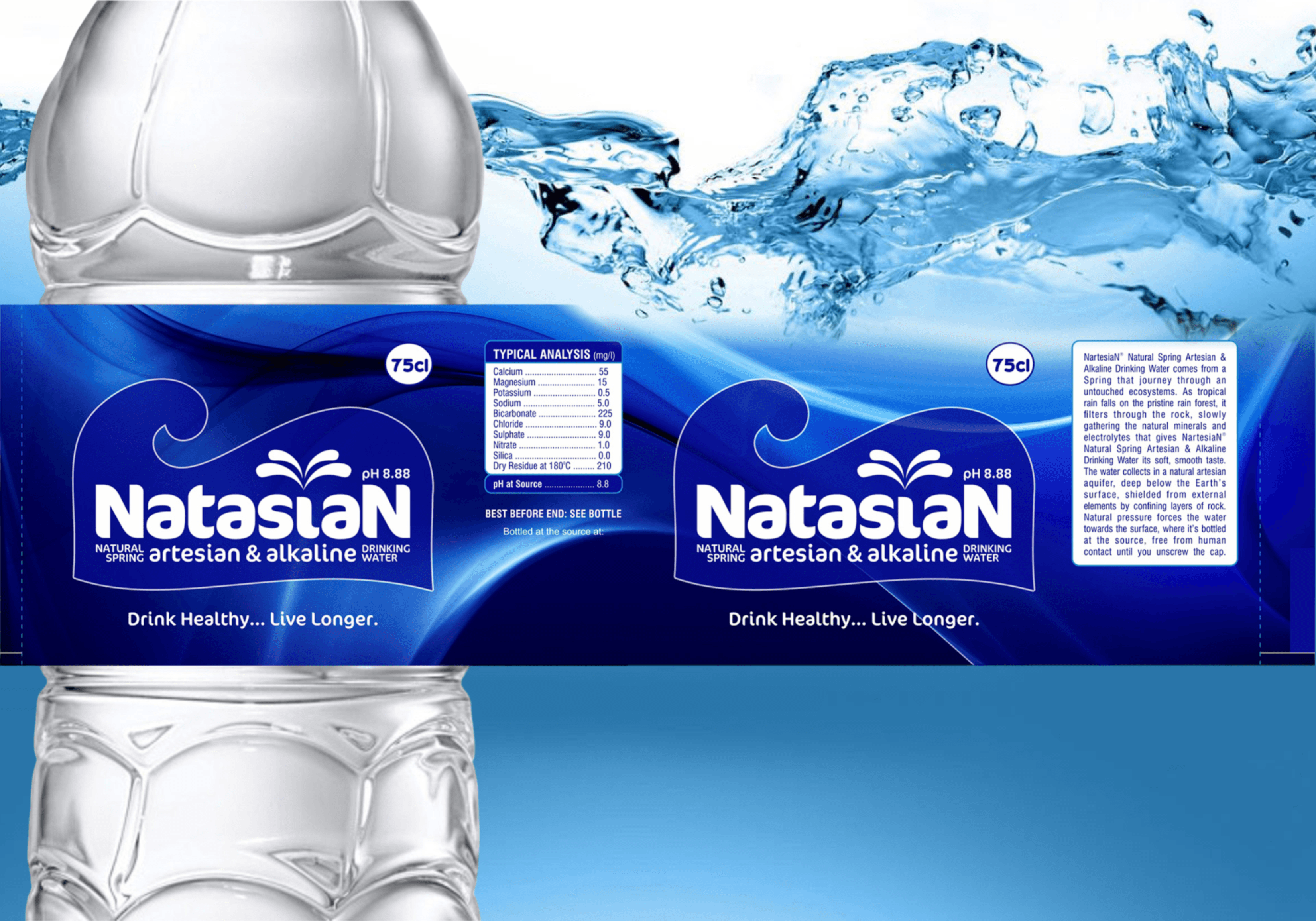
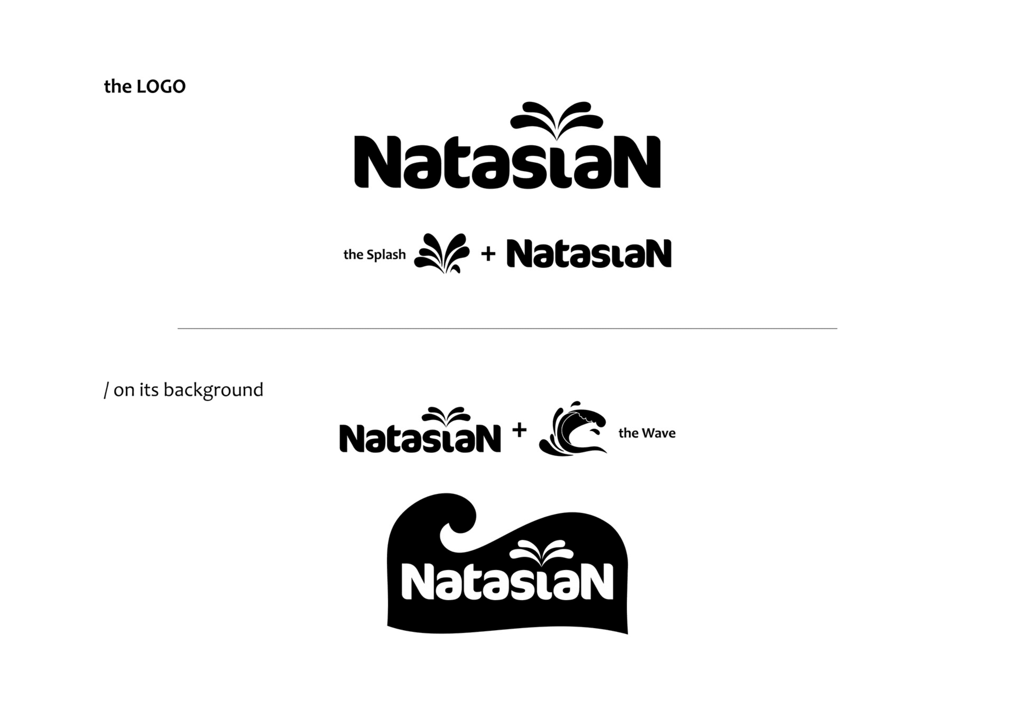
We explored water as the central visual idea, developing the splash/wave symbol as a distinctive brand asset and integrating it with the Natasian wordmark. The identity was then tested against the bottle and label to ensure that the visual system remained clear in a real-world application.
The outcome
The final identity created a stronger connection between the product and its natural-water proposition, giving Natasian a visual language that could move consistently from the logo to the physical packaging.
Gallery
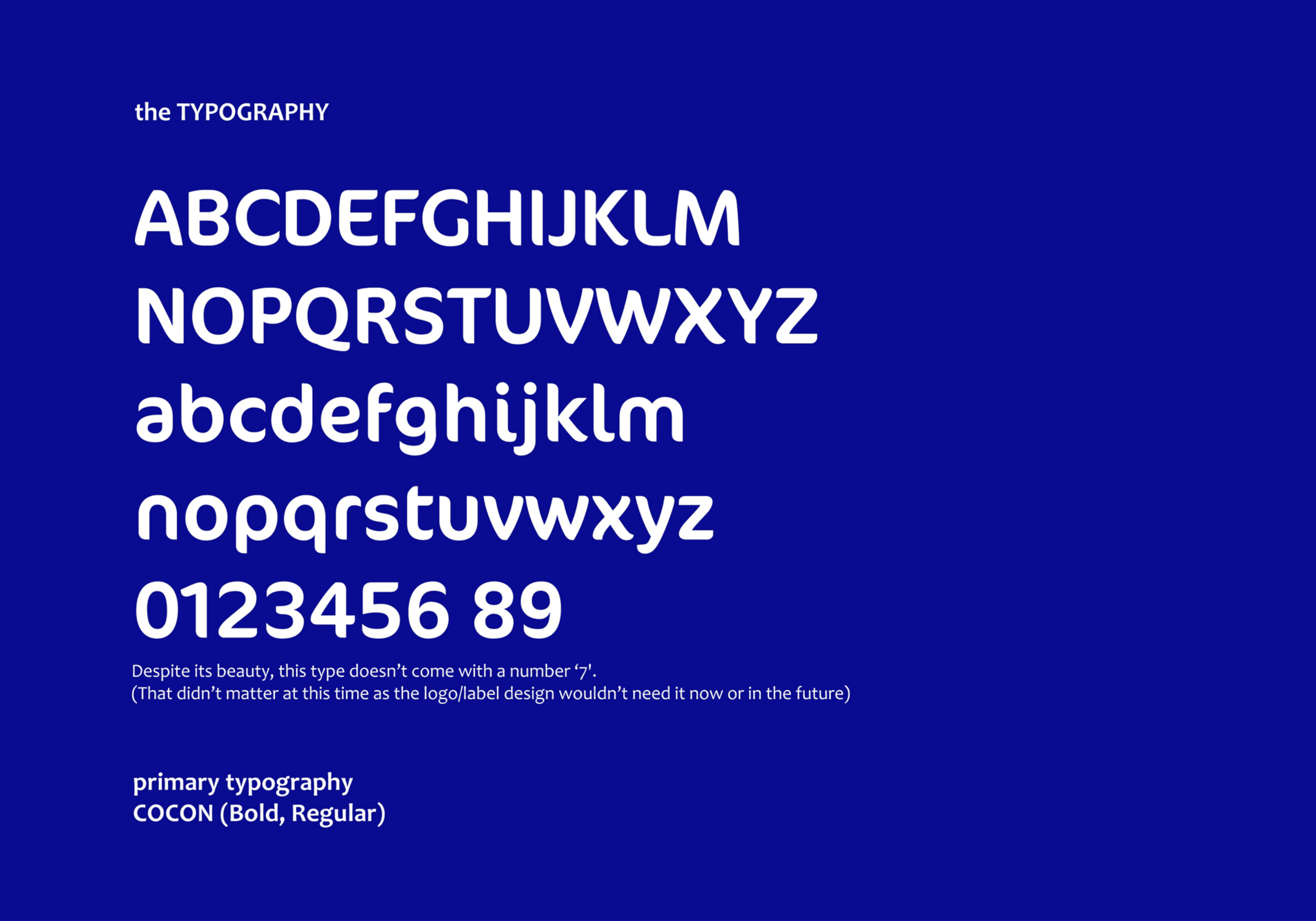
- WOW Impression Studios (Now merged with Polongo Africa)
Start here
Have something like this in mind?
Tell us what you're trying to build and we'll tell you how we'd approach it.